Prioritizing MTA Stations by Targeted Commuters
- MTA Subway Commuter Analysis
- Data Resources
- Data Processing
- Commuter Counts
- Station Locations
- Targeting Demographics
- Day and Time
- Overview
MTA Subway Commuter Analysis
As part of the Metis Data Science Bootcamp, we were given the project of working with a mock non-profit called WomenTechWomenYes (WTWY) who is planning on going to New York MTA subway stations to pass out pamphlets advertising their Women in Technology gala. The gala was planned for the end of May, so they would be canvassing in April and May. Their goal was to increase participation in the gala and to spread awareness of WTWY. Our plan was to optimize the time of the street times passing out pamphlets by showing them the best times and stations to go to.
Data Resources
In order to acheive this, we wanted to maximize not just the number of commuters the street teams would see, but the number of people who would most likely be interested in their program and gala. This means we needed data on subway traffic and demographic information about who would be likely be using the subway stations, including sex, education, and profession.
We gathered numeric information from multiple sources, including:
- Subway station commuter entrance and exit counts for turnstiles and GPS coordinates of subway stations from the website http://web.mta.info/.
- Demographics of the surrounding neighborhood in which the subway station is located from https://opendata.cityofnewyork.us/.
- Locations of technology startups from http://www.digital.nyc/.
The demographic information included sex, highest degree attained, and area of profession. The technology startups could be used as a tracer for tech hubs, and then the GPS coordinates of the stations could be used to isolate stations near those hubs. By combining this information, we sought to increase the likelihood of canvassing female employees of technology companies.
Data Processing
Turnstile and Station Identifiers
For reference, here is a sample of the data taken from web.mta.info:
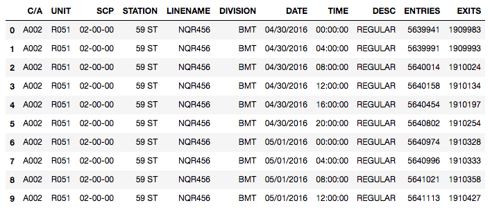
The turnstile data was created by audits of the turnstiles every 4 hours. The turnstile data includes
- Control Area (C/A),
- Unit, a unique identifier for each station
- Subunit Control Positions (SCP)
- Station, the name of the stop
- Linenames of subway lines served by the station
- Division (original subway line)
- Date of audit
- Time of audit
- Description of audit (usually “Regular”)
- Cumulative entries
- Cumulative exits
Below is a sample of the data for stations with the name 135th St (135 ST).
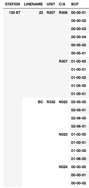
Because stations are identified by the stop, there were multiple stations with the same name (there is a 135th St. stop for lines 2/3, and lines B/C). Thus, we needed to identify stations by both the “Station” value and the “Linename”. (A station could also be identified by its Unit number, although we found that was not descriptive enough for our needs below.)
Within each station, there can be multiple C/A’s, all of which have a unique identifier (Line 2/3, 135th St. station has C/A’s R306 and R307). Each C/A has multiple turnstiles identified by it’s SCP, but the SCP number is not necessarily unique across different C/A’s (N024 and R306 both have a turnstile with SCP number 00-00-00). Thus, a unique turnstile needed to be identified by both the C/A and SCP (or C/A and Unit).
Turnstile Data
The entry and exit counts for each turnstile are cumulative total counts every 4 hours. In processing this information, we identified that some turnstile cumulative totals decreased. Some of these decreases were due to the counts being reset. A few turnstiles would continually decrease over some periods of time for unknown reasons. Any negative counts were removed from the data.
Not all 4 hour increments for the audits were synchronized. Most turnstiles gave counts at midnight and every 4 until the next midnight. The second most common series started at 1:00am. Most of the remainder had start times that were completely random. To fix this, and to synchronize the data, we considered anything between 10:00pm and 2:00am as being midnight. This shifted some of the data by at most 2 hours, but it allowed us to more directly compare the turnstile counts based on morning, midday, and afternoon intervals. Further, by not limiting the turnstiles to only those being audited at specific hours, we nearly doubled the
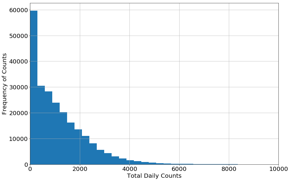
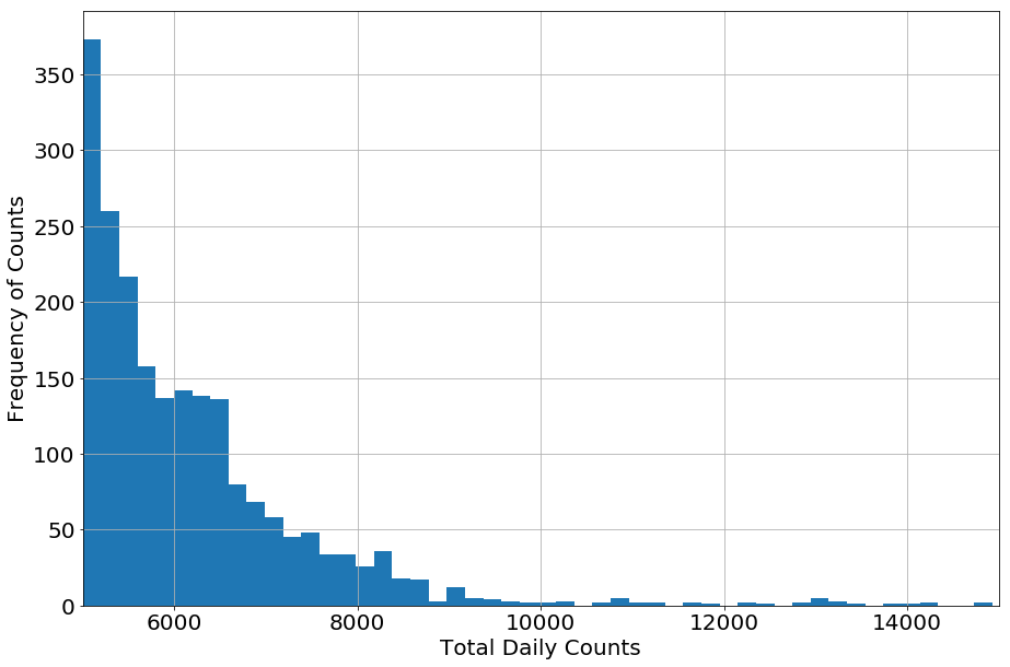
Some counts were unrealistically high. To fix this, we made an upper limit of counts we would accept. To decide what this limit should be, we created a histrogram that binned the counts for all turnstiles (shown below). Most counts are zero (from when stations are closed) then the number of times higher counts decreases until at about 9,000 the frequency of counts becomes sparse. Some of these higher counts could be due to events, but we did see that for a few stations, they did get up to 10,000 on a more frequenty basis so those are not likely outliers that should be removed. We thus used 10,000 as an upper limit, leaving commuter counts that are likely real and typical for each turnstile.
Commuter Counts
After the data was cleaned, we calculated the counts for each 4 hour interval by finding the difference in counts between audits.
    df_4hour = df.copy()

    #Create columns for total counts by each 4 hours
    df_4hour['New_Entries_Hour'] = df_4hour.groupby(['Turnstile'])['ENTRIES'].diff().shift(-1)
    df_4hour['New_Exits_Hour'] = df_4hour.groupby(['Turnstile'])['EXITS'].diff().shift(-1)
    df_4hour['Counts_Hour'] = df_4hour['New_Entries_Hour'] + df_4hour['New_Exits_Hour']
We could then see the total traffic for each station by totaling up the counts in the 4 hour intervals.
    df_station_total = df_4hour.groupby(['STATION-LINE'])['Counts_Hour'].sum().to_frame().reset_index()
    df_station_total = df_station_total.rename(columns={'Counts_Hour':'Counts'})
    ranked = df_station_total.sort_values('Counts', ascending=False).reset_index()
![]()
Station Locations
The table of coordinates for stations provided by web.mta.info has Station ID numbers for each station, which are not included in the turnstile data. Further, they did not provide a way to connect Station ID to any of the station identifiers in the turnstile data. To connect these two sets, we needed an intermediate set of information. Fortunately, we found this in a table provided by someone online who created a list of MTA station that contained both Station ID and Unit numbers.
    # Intermediate data connecting Station ID and Unit values
    rbs = pd.read_csv('../challenges_data/Remote-Booth-Station2013.csv')
    df_coords = pd.merge(df,rbs[['C/A','STOPID']],on='C/A')

    # Read in coordinates from web.mta.info and merge
    coord = pd.read_csv('http://web.mta.info/developers/data/nyct/subway/Stations.csv')
    coord = coord.rename(columns={'GTFS Stop ID': 'STOPID'})
    df_coords = pd.merge(df_coords,coord[['STOPID','GTFS Latitude','GTFS Longitude']],on='STOPID')

    # Check that all stations have coordinates (should be False)
    df_coords[['GTFS Latitude','GTFS Longitude']].isnull().values.any()
Now that we had the coordinates of each station, we could find the stations within a targeted region. We found that the tech startups on digital.nyc did trace out the tech hubs in Silicon Alley and Lower Manhattan.
To get stations near tech hubs, we used coordinate boxes that encompassed those areas, and did a search of stations within that area. For example, to search the area of dense tech companies just south of Central Park, we limited the search to staitons with longitudes between -73.994992° and -73.975443°, and latitudes between 40.735691° and 40.759721°.
    latitude = [40.735691, 40.759721]
    longitude = [-73.994992, -73.975443]
    target_area = df_coords.copy()
    target_area = target_area[target_area['GTFS Latitude']>latitude[0]]
    target_area = target_area[target_area['GTFS Latitude']<latitude[1]]
    target_area = target_area[target_area['GTFS Longitude']>longitude[0]]
    target_area = target_area[target_area['GTFS Longitude']<longitude[1]]

    # Get the ranking of the stations in the target area.
    target_area_ranks = ranked[ranked['STATION-LINE'].isin(target_area['STATION-LINE'])]
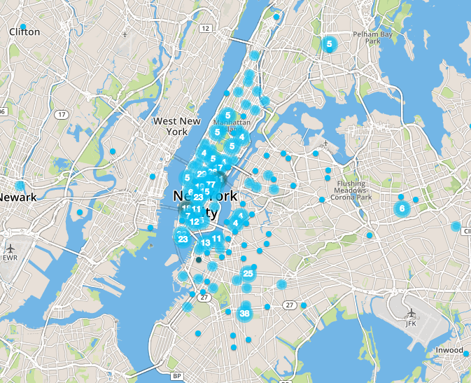
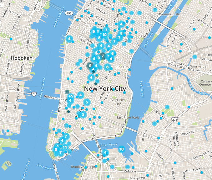
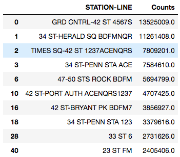
The following is the dataframe created showing the top stations in the target area, showing their positions for all of New York City, and the total counts for April/May 2016.
Targeting Demographics
While canvassing at the busiest stations will result in the street teams being able to canvass to the most people, they may not necessarily encounter the most people who would be interested in the WTWY gala. To target the demographics, we weighted the commuters by the demographics of the surrounding community. We multiplied the total number of people by the percent who are female, who have a Bachelors degree or higher, and who are in the science and technology profession.
Many of the top stations stayed the same after weighting by demographics, but some showed a large change due to a smaller number of target commuters. Typically the percentage of residents around the stations with Bachelors was in 30-40’s range, graduate degree percentages were also in the 30-40’s, and percentage of careers in professional and scientific industries in the 10-20’s. But, as an example, Flushing-Main St. (Line 7) is in a neighborhood with residents having significantly fewer Bachelor degrees (17%), graduate degrees (8.1%), and careers in professional and scientific industries (9.1%). While Flushing-Main St. was the fourth busiest station, it dropped to the 22nd top station of targeted commuters.
We compared the top 10 busiest stations with the top 10 suggested stations based on demographics, and found that because there were simply 5% fewer total commuters in our suggested stations, there would be a 4% drop in total females the WTWY canvassers would encounter. However, the commuters would be targeted, so there would actually be an increase of 1-2% more females in technical professions (6% more people in technical professions when including males) and 5% more females with graduate degrees (10% more people when including males). The number of females with Bachelors did not change (but there were 5% more people when including males).
These demographics are for the residents, and doesn’t include the commuters from other communities who would be coming to those stations for their jobs. Since we have also targeted stations near tech hubs, this would further increase the percentage of people who would likely be interested in the WTWY gala.
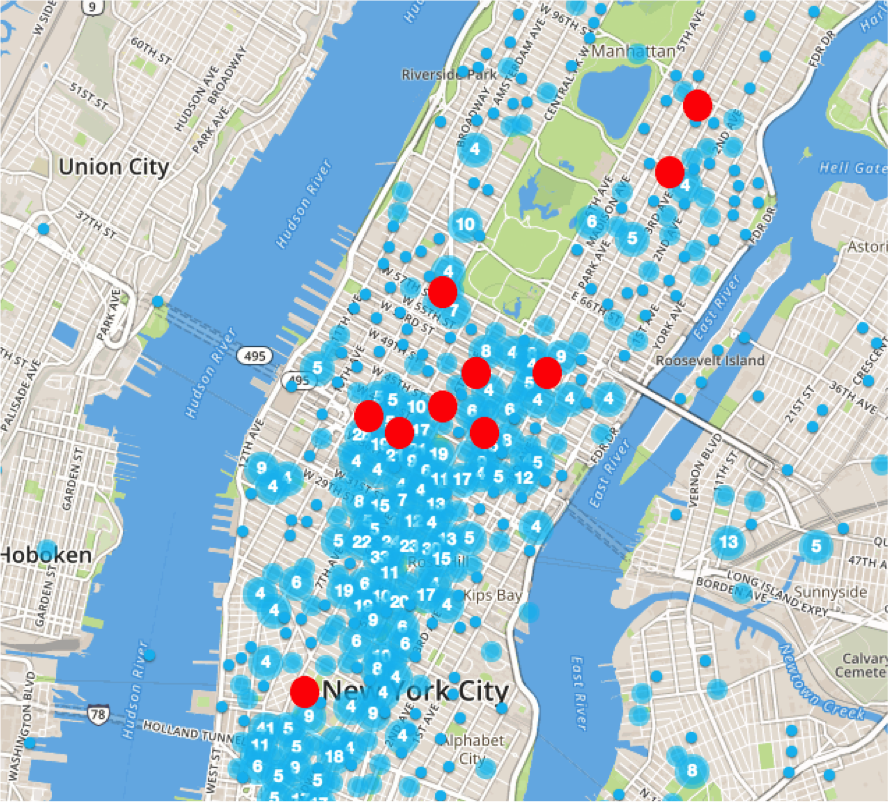
Given our target demographics, the stations near NYU, Cornell University, and Georgetown University were included. This means the academic community will also be included with these stations.
Day and Time
To test which days would be best for the street teams to canvass, we looked at the amount of traffic for the stations by day of week. We found that consistently the weekdays showed much more traffic than weekends (as expected). To illustrate this, below is the average daily subway traffic (entries plus exits) for Grand Central Station in April/May 2016.
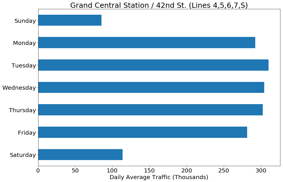
However, while there is less traffic on the weekend, there are still commuter counts in the 10’s and 100’s of thousands. While the teams may not interact with as many people, they may not be in a rush to get to work or back home and perhaps more likely to talk with the street teams, so that would need to be taken into consideration.
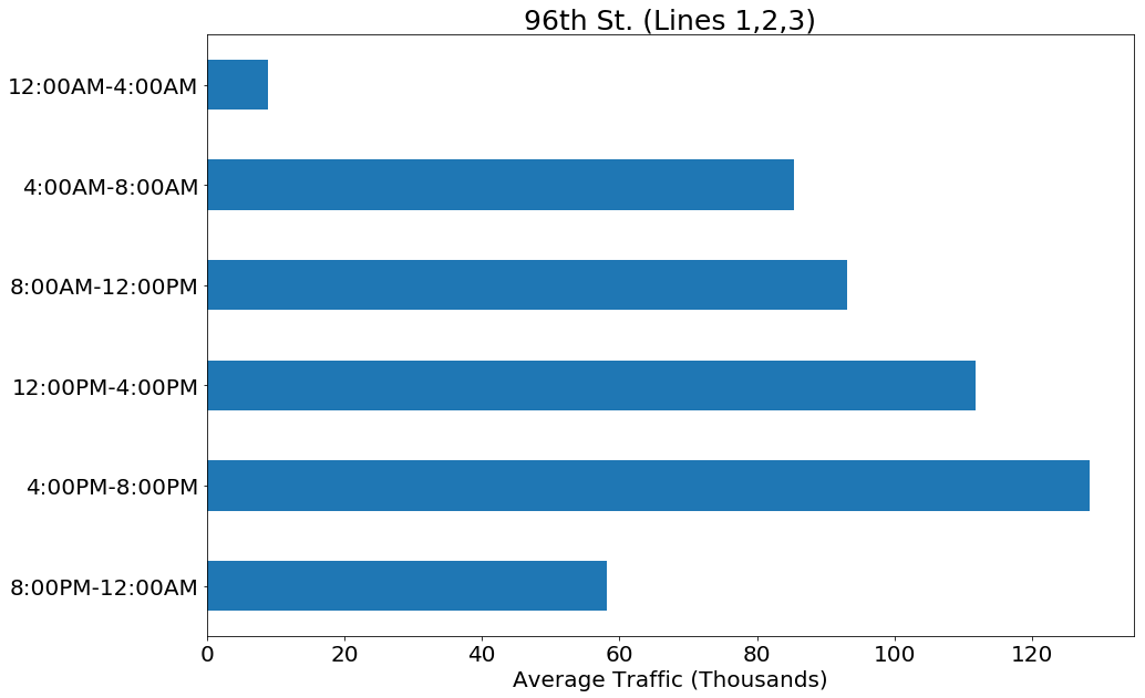
In order to look at the best times for street times to canvass during the weekdays, we looked at traffic rates for different times of the day. We found that not all stations showed the same traffic pattern trends. All the stations we looked at did peak in the afternoon rush hour, but how it compared to the rest of the day varied. Some stations showed an increase from morning to afternoon, like that seen at the 96th St. station for lines 1,2,3:
Other stations showed a double peak in the morning and afternoon traffic, as seen in the Lexington Ave / 53rd St. station for lines E,M,6:
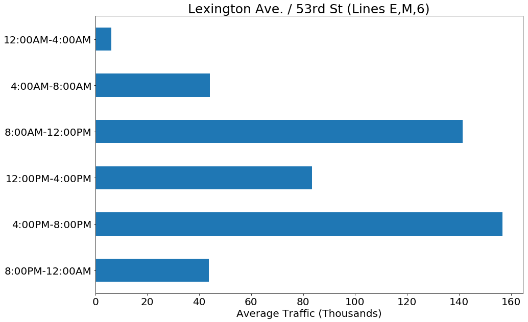
Others showed a combination of these two patterns with the morning rush hour traffic ranging from moderate to high traffic. This affects which stations would be best to go to in the morning and afternoon, as it would be better to go in the afternoon to stations with low morning traffic, and then go in the morning to stations that have double peaked traffic patterns. For the top ten stations for our target demographics, we found that five showed relatively lower morning traffic, and five had relatively higher morning traffic, making it easy to divide up which stations to visit in the morning or afternoon.
Overview
By using commuter rates, demographic information, and location data for MTA subway stations, we were able to create a priority list of stations that would most likely have commuters who are famales with higher education degrees and careers in tech industries, as well as the academic community from top-tier universities. While these stations did show 5% less traffic, they actually resulted in an increase of 1-2% females in science/technical professions and 5% more females with graduate degrees. We were also able to identify optimal times for WTWY to be convassing for their gala, and showed that station priorities would change between morning and afternoon rush hours as some stations would have higher traffic in the afternoon while others showed little difference.
With this information, we would be able to create a canvassing schedule based on the availability of WTWY street teams and the number of days they are able to work. Using the methods shown above, if the workers were available on more days, we could expand their work to new priority stations in parts of tech hubs not yet covered.