Visualizing Matrix Transforms, PCA, and SVD
Matrix Transforms
The following is to demonstrate different types of matrix transformations that can be done to a data set or image. For each of the following, if x is the dataset (as a vector), and A is the transformation matrix of T, then
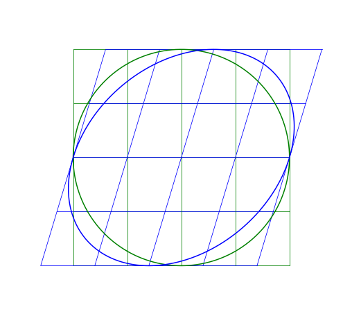
T = AxIn other words, A is transforming x to become T. I’ll apply matrix transformations to this circle and grid:
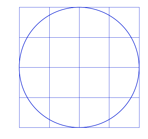
For each of the following, the blue will be the transformed image, green is the original.
Scaling Matrix
A scaling matrix is a diagonal matrix where the diagonal elements (here v_x and v_y) don’t need to be one:
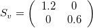
For example, if we use v_x=1.2, it will make the image larger in the x-direction (because v_x>1), while v_y=0.6 will make it smaller in the y-direction (because v_y<1).
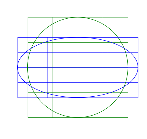
Rotation Matrix
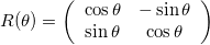
A rotation matrix will rotate the data around the origin by an angle \theta, and follows:
Here I rotate the image by a positive 20^{\circ}. Notice that it rotates counter-clockwise.
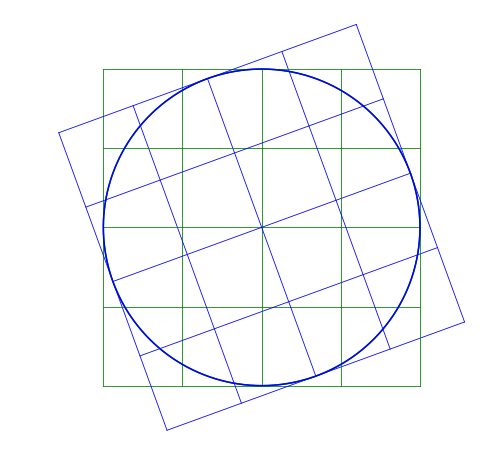
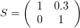
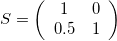
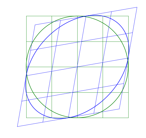
Shear Matrix
A shear matrix will basically tilt an axis by having a non-zero, off-axis element.
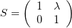
The larger the \lambda, the greater the shear.
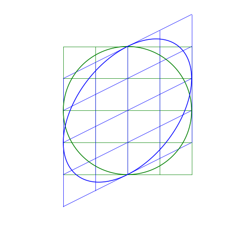
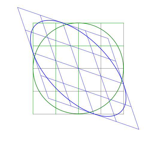
Skew-symmetric Matrix
The skew matrix will shear the axes the same amount but in opposite directions. A skew matrix will not rotate the data, but will shear the axis the same angle in opposite directions. This does the same as the scaling matrix, but instead of scaling along the axes, it scales at an angle.
The angle \theta does not determine the angle of the skew, rather sin \theta gives the slope of the axes relative to the unskewed axes.
Multiple Transformations
A transformation can be the combination of transformations. For example, a skew-symmetric matrix can be replaced by a combination of a rotation-scale-derotation:
This can be understood visually by the image being rotated, scaled along the x- and y-axes, then rotated back so the scaling appears as a skew. (Or, tilt your head when looking at the skew images, it’s just like a scaled image but at an angle.) But mathetmatically, since the skew-symmetric matrix is symmetric, it means it can be described by the relationship:

where Q is an orthogonal matrix (Q=-Q^T) and D is a diagonal matrix. Notice that the rotation matrix is orthogonal (and R(-\theta) = R(\theta)^T) and the scaling matrix is diagonal.
Another way to think of it is the matrix D is the diagonalization of A. The magnitude that D scales the image is the same as A, but the axes of D are just aligned with the direction A scales it. Those directions that A scale, and that the elements D are aligned in, are the principal axes. This brings us to principal components.
Principal Component Analysis
A covariance matrix shows the covariance of two vector elements in a dataset. The covariance of the i and j elements is the same as the covariance of the j and i elements (order doesn’t matter). This means the i,j component of the covariance matrix are the same as the j,i component, so the covariance matrix is symmetric. The covariance matrix C can thus be decomposed:

where V is a matrix of eigenvectors and L is a diagonal matrix of eigenvalues. We can think of this as V^T rotates the data, L is the scale of the data in the different directions, and V de-rotates the data back to the angle it started.
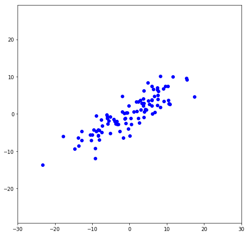
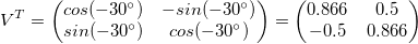
To illustrate this, I’ll make data that’s centered at the origin (or, de-meaned, which is necessary for the matrix transformations to be correct). It has a slope that is at 30^{\circ} from the x-axis.
    angle = 30.*np.pi/180. #in radians
    x1 = np.random.normal(loc=0, scale=8, size=100)
    x2 = x1*angle + np.random.normal(scale=3, size=100)
    x1 = x1-np.mean(x1)
    x2 = x2-np.mean(x2)
    x = np.column_stack((x1,x2))
First, let’s rotate the data so it’s not sloped (or, the greatest variance is in the x-direction):
    rot = np.array([[np.cos(angle), -np.sin(angle)],
                    [np.sin(angle), np.cos(angle)]])

    x_rot = np.matmul(x,rot)
Let’s find the variance in the x- and y-directions (we’ll use this later):
    print("Variance in X:",np.var(x_rot[:,0]))
    print("Variance in Y:",np.var(x_rot[:,1]))

        Variance in X: 81.4045
        Variance in Y: 4.68242
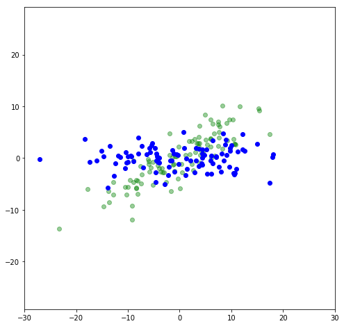
Let’s get rid of the variance in a direction that has the least amounnt of variance, the y-direction. We can do this with a matrix transformation by having 1 in the x-x position, and zero everywhere else:
    flat = np.array([[1,0],
                     [0,0]])
    x_flat = np.matmul(x_rot,flat)
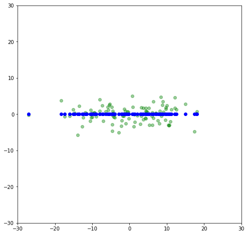
Now let’s rotate it back to a slope of 30^{\circ} and compare to the original.
Now the data lies along an axis along which most of the variance in the data lies. This is the principal axis. By projecting the data onto that axis, we are looking at a principal component. Let’s use scikit-learn’s PCA package and compare its results to what we did. First, let’s print out the principal components:
    from sklearn.decomposition import PCA
    pca = PCA()
    p = pca.fit(x)
    print(pca.components_)

        array([[-0.8611, -0.5084],
                [ 0.5084, -0.8611]])
The magnitudes of the principal components are the same as the rotation matrix we used. (Negative values just mean it rotates by more than 90^{\circ}, so it’s projection on the x-axis would just be a mirror image of the image above, but gives same results.) The rows in this matrix are the eigenvectors, showing the direction of most variance, second most variance, etc.
Next, let’s print out the explained variance:
    pca.explained_variance_

        array([ 81.4119,   4.6751])
Notice this is almost exactly the same as the variance we calculated. These are the eigenvalues that show the relative importance of the different components based on their variance. If you want to see how much of the total variance is explained by the different components, you can divide each eigenvalue by the sum of the eigenvalues.
    pca.explained_variance_/(np.sum(pca.explained_variance_))

        array([ 0.9457,  0.0543])
This means 94.6% of the total variance is along the first component. However, there’s a faster way to get the ratio of explained variance:
    pca.explained_variance_ratio_

        array([ 0.9457,  0.0543])
Singular Value Decomposition
Singular Value Decomposition (SVD) is similar to principal component analysis, but has a different matrix transformation decomposition:

In this case, the V^* is the complex conjugate of V, and it still contains the eigenvectors of M (it is still rotating the data):
    U,s,V = np.linalg.svd(x)
    print(V)

        array([[-0.8611, -0.5084],
               [ 0.5084, -0.8611]])
\Sigma contains the singular values, which are proportional to the standard deviations of the data in the different axes.
    print(s)

        array([ 90.2286,  21.6220])
To get the variance, you need to square the standard deviations and divide by the number of points (I used 100 points):
    np.power(s,2)/100

        array([ 81.4119,   4.6751])
The columns of U all have the same noise such that the variance times the number of datapoints is unitary for all coordinates:
    print(np.var(U[:,0])*100)
    print(np.var(U[:,1])*100)

        1.0
        1.0
Or, another way to think of it is the standard deviation times the square root of the number of points is also one:
    print(np.std(U[:,0])*np.sqrt(100))
    print(np.std(U[:,1])*np.sqrt(100))

        1.0
        1.0
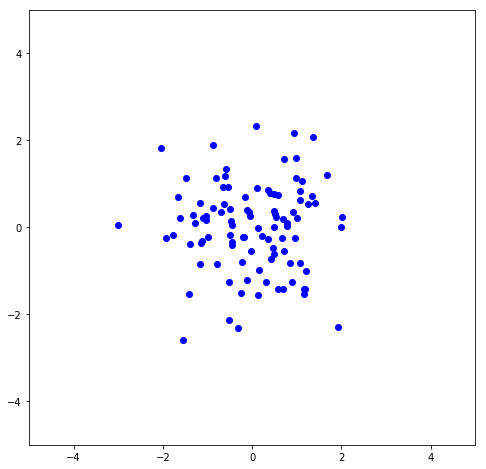
Here I plot the first column vs. the second column of U to show the noise.
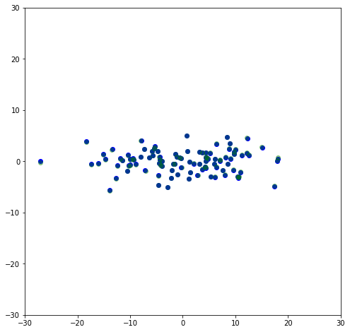
\Sigma can then be used to scale U to it’s original magnitudes, so U \Sigma should be the dataset that was rotated to remove the slope. Here I plot both the U \Sigma (the negatives are just because of the rotation made by the SVD fit being 210^{\circ} instead of 30^{\circ}) along with the rotated data shown above, and it can be seen they are overlapping to where they’re basically indistinguishable.
    plt.scatter(-U[:,0]*s[0],-U[:,1]*s[1],color='blue')
    plt.scatter(x_rot[:,0],x_rot[:,1],color='green',alpha=0.4)
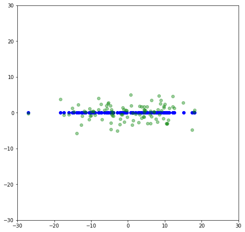
This is the adjusted dataset where it is aligned with the principle axes. Like before, if we set the second component of \Sigma to be zero, we will get the first principal axis.
    plt.scatter(-u[:,0]*s[0],-u[:,1]*0,color='blue')
    plt.scatter(x_rot[:,0],x_rot[:,1],color='green',alpha=0.4)